CALIFORNIA CLASSIC
This was a special project for me. My younger brother enlisted my support to help him find his dream home. One of the houses we came across was a large, Mediterranean-style dwelling. Though sizable and undeniably elaborate, it was quite dated. I recall the feeling of being sucked into a dark cavernous abyss as I entered through the overgenerous front doors. The architectural moldings were stacked layer upon layer. The natural stone floor radiated a bright burnt orange hue. I squinted. Faux-finished walls and gold leaf detailing was an extra dose of ocular insult.
Despite all the noisy components, the flow was elegant. The dining room, partially visible from the front door, lay adjacent to a whimsical spiral staircase. The kitchen danced into the living room and twirled into an oversized bonus room, where a bar for entertaining was on full display. I could see the ceilings were high. A cigar lounge, movie theater, and plenty of bedrooms were all included in this grand home. Yet, I still had an overwhelming sensation of being squished in between four walls. I closed my eyes and, instead of seeing the home, I felt the space. With every inhalation I sucked in the old, then breathed out the new. I saw it! A classic California home with an effortless vibe. I visualized expansive rooms with cozy furniture and lots of natural light. With a smile on my face and excitement in my eyes, I turned to my brother and said, “This is a no-brainer. Buy it!”
Within one month, we began our transformation. The heavy texture on the walls, doors, and trim had to be sanded to a smooth finish before we could paint. This process took almost an entire month. During this phase, I would bring color swatches to the house, all different shades of white. As the day progressed, I would observe how each swatch interacted with the rooms. Normally, I have two to three whites I rotate between, but for this project, the entire essence of the renovation hinged on this paint color. I had one opportunity to get it right, and I wasn’t leaving it up to chance. The final selection was Cool December by Dunn-Edwards Paints. Walls, doors, and trim all received the same treatment. With paint alone, the house began to morph. Excessive trim became elegant architectural accents, and newly sterile walls tempted light to bounce around.
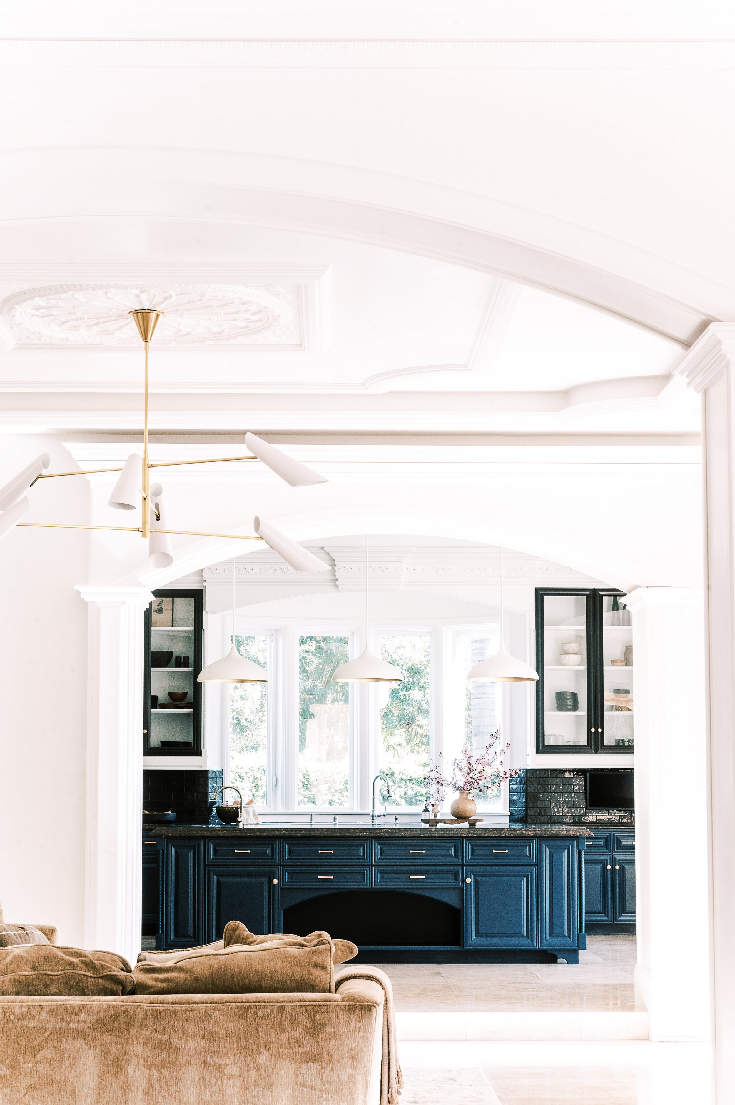
Even with a newfound openness, the kitchen’s sizable footprint had some challenges. The solitary island was enormous. I had trouble reaching its center. There was an illusion of a large gaping hole. It was an immense visual block. Black counter tops severely contrasted with caramel cabinets. To zoom this kitchen into focus, I created an interplay of dark and light. Not wanting an absolute contrast of black and white, Hague Blue by Farrow and Ball was chosen as the shade to balance the murky counter tops and define the dimensions of this space.
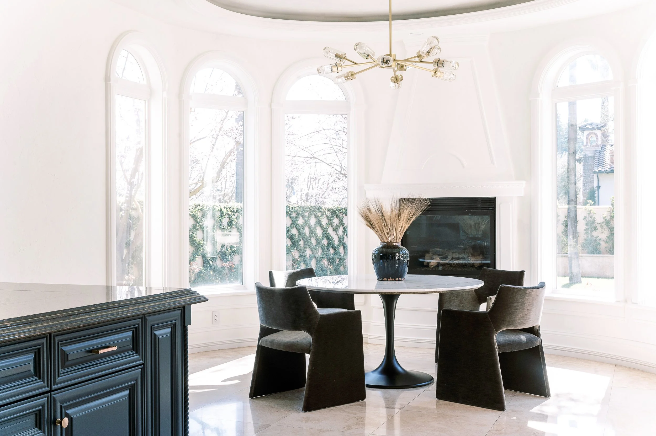
Newly installed kitchen pendants float down and anchor dominantly over the kitchen island, and a black brick backsplash adds a hint of masculinity. Removing shutters from the breakfast nook revealed breathtaking picture windows and a beautiful backyard view. Simple furniture and luxurious textures keep the space open and airy. A delicate chandelier casually tops off the look. While my brother is not a Michelin Star chef, he does love to entertain. When it came to styling the glass front cabinets, I casually displayed rustic dough bowls, French glazed pottery, and a variety of wood cutting boards to ensure he had all the necessary party accoutrements.
Despite the home’s outstanding bones, there was one space that seemed entirely improvised. The living room with its relatively minor size and awkward orientation kept me up for nights. The entire length of the room was covered in glass, which let in too much harsh sunlight. The remaining walls weren’t really walls at all. They were large openings leading to other massive rooms. The living room looked like a pass-through or vestibule, where one room stopped and another one began. I thought about the possible ways to lay out the furniture. A symmetrical arrangement seemed too formal. Multiple smaller pieces seemed too minimal. What about the TV? Where would that go?
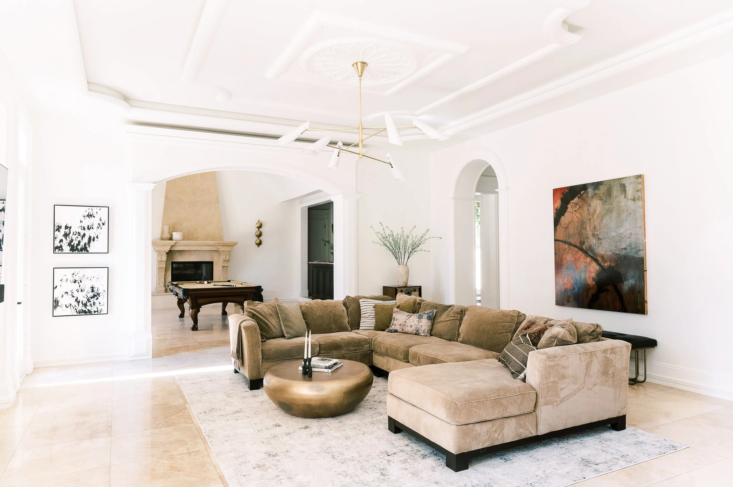
I came up with a plan to cover up some of the windows, which allowed me to create a backdrop for the television and add a fireplace. To distract from the room’s small size, I pulled the furniture away from the walls. A slouchy, traditional sectional pairs seamlessly with a voluminous drum cocktail table in burnt brass. Adding to the room’s eclectic feel, a custom abstract piece of art, by a local artist, and vintage record player lightly decorate the space. And, of course, the cherry on top is the large quirky chandelier. It’s pivoting shades allow light to flow in all directions. The ornate ceiling medallion is an unexpected twist that plays well with the rest of the space.
My favorite room in every house is the formal dining room. I love taking a glimpse into the way people entertain. Maybe it’s the Armenian in me, but dining rooms reveal so much about a person’s preference concerning a whole bunch of things. For my brother, I wished to juxtapose farm-to-table sensibility with stylish modernism. The dining room table of reclaimed Douglas fir centers on an elaborate Rococo fireplace. Modern art is loud against a stark backdrop, while the minimalist light fixture provides necessary light without overwhelming the space. To round out the room, low-back dining chairs, upholstered in a burnt amber chenille, artfully dress up the space.
Additional highlights of the transformation are the moody cigar lounge, peaceful master suite, and grand bonus room. The cigar lounge, situated off the entry, was outfitted with an innovative exhaust system that is concealed and silent. Dark wood paneling from the previous homeowner remains untouched, and generous lounge chairs fill the space. The framed piece of contemporary art is actually a TV in disguise. The master suite was designed with the goal of promoting a sense of openness and rejuvenation. A plush bed rests solely with simple iron side tables. Stepping down into a cozy lounge, casual accent chairs and an antique wagon wheel stool keep the space austere.
Without a doubt, this home can best be described as a diamond in the rough. The transformation from heavy and dated to calm and stylish is unquestionable. But most importantly, it fits the lifestyle and sensibility of its inhabitants: a young man, with a bright future, who is set to take on the world.
Interiors Editor Erin Melkonian
Interior Stylist Danielle Lion
Photographer Ellie Koleen
Erin Melkonian
Interiors Editor
Erin runs a collaborative design firm, EMID Design Group, specializing in healthcare, hospitality, and residential interior design, in Fresno, California. Seeing the world through an artistic lens has allowed Erin to experiment in a number of different styles. Everything she does with a space is deliberate. Every piece has a purpose and has been thought about, from color, to position, to scale in order to create the most unique and personal spaces for her clients.


