MARBLE MADE MODERN
“The bold finishes were balanced with an intricate smoke crystal chandelier from Restoration Hardware, and custom
drapery panels brought softness to the space. Fuchsia florals provide the only pop of color. Their boldness stands up to the daring floors.”
Can’t buy me love…but a good dining room? Sure! We were lucky to work with one of Fresno’s ultimate boss babes on her fashion-forward home. The goal was a complete redesign of the dining room. Her glamorous aesthetic, retro tendencies, and oh-so-cool demeanor were the jumping-off-point for this design. White, black, and gray were the colors of our working palette. From there, we designed custom marble floors, added metal accents, and finished the space with unique accessories that added glam and color.
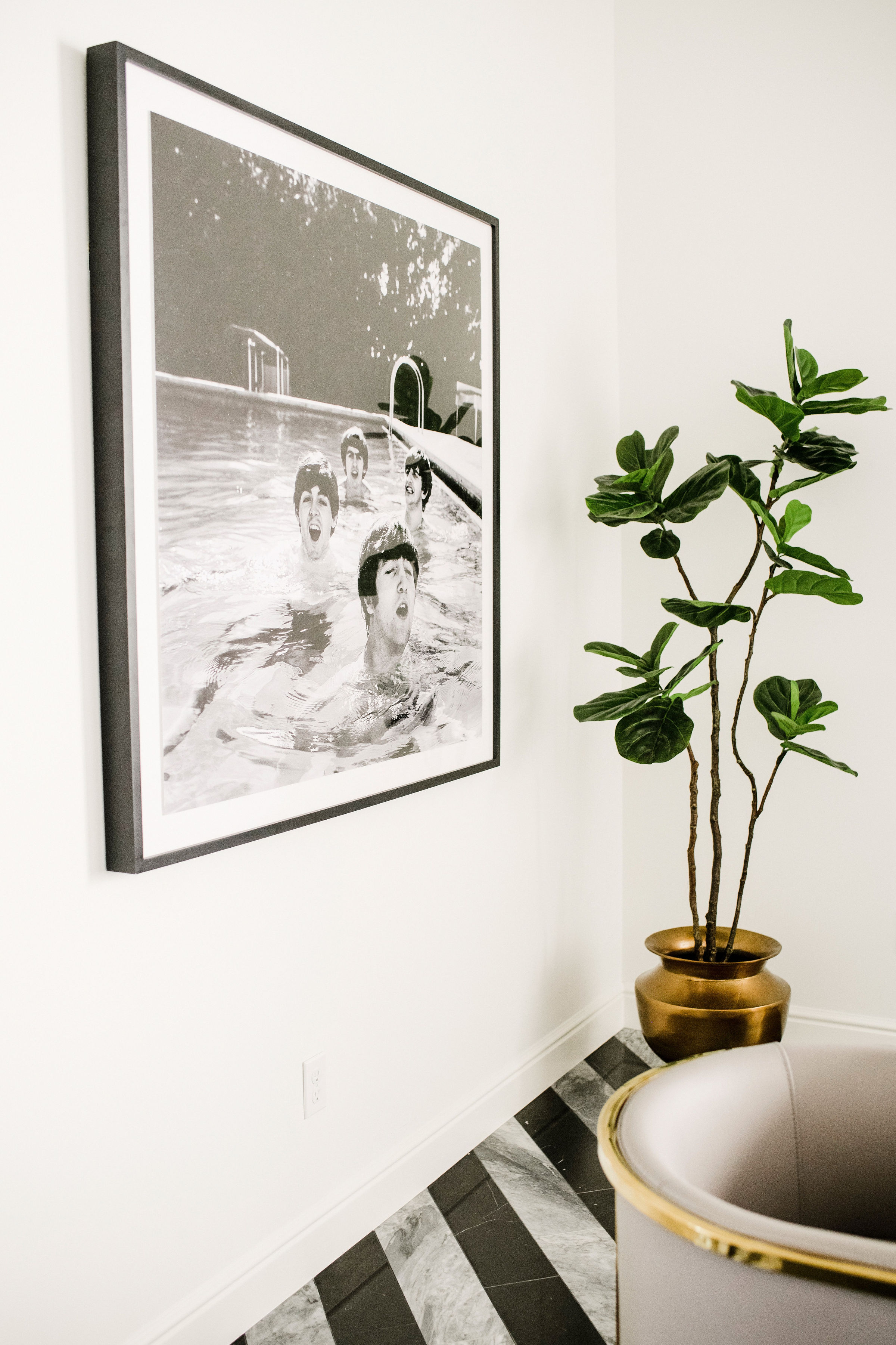
Since the colors we desired were quite sterile, I had the idea to do a custom marble floor—it would be the room’s focal point. Several sketches were created depicting different pattern forms. Ultimately, a quadruple chevron pattern was selected. Breaks of chunky black marble bisect the pattern, so as to not overwhelm the eye and ground the space. The marble was sourced through Creative Tile Showroom, and a long-time local tile artisan performed the installation.
The original wall color was a deep gray shade. The new walls were painted stark white (Benjamin Moore, Winter White), which provide a refreshing contrast with the hardness of the floors. The baseboards throughout the home were already white. Thankfully, repainting them the same color was a great option because they fade into the background, making way for the star of the room to shine through: the floors!
As for the furniture, the footprint of the room was rather small. Furniture pieces were carefully selected that were low in height, but big on wow! The client requested to keep her current dining table. Working off that, dining chairs upholstered in gray leather with gilt bases did not exceed the height of the table. The black lacquer sideboard with acrylic accents remained low in stature.
An extra-high ceiling paired with low furniture left a fair amount of wall space. I utilized this area to connect the room vertically. The simple colors of the room felt refreshing, and I didn’t want to take away from that ambiance. The accessories selected were minimal yet tall. More height was added by hanging porcelain carnations above the sideboard.
The client, a self-proclaimed Beatles enthusiast, wanted art that highlighted her deep adoration for the English rock band. After much searching, we came across a candid photo of the Fab Four shot for TIME magazine in 1964. Not only does this piece marry the client’s favorite musicians to the space, but it perfectly tops-off the room’s ultra-cool, ultra-retro, ultra-glam appearance.
Interiors Editor Erin Melkonian
Principal, Erin Melkonian Interior Design
Interior Styling Olivia Schmitz
Senior Designer, Erin Melkonian Interior Design
Photographer Ellie Koleen


