
A CLEAN SLATE
The Best White Paint Colors

As a designer who loves color, selecting the perfect white paint has always been a challenge. For years, every time I was tasked with picking a shade of white, I would shrink into the corner and procrastinate like hell. It’s all the undertones. The undertones scare me. The sage greens and butter yellows that lurked just under the surface had the potential of derailing my entire design. Maybe I should just paint the room navy blue? Or how about olive green? Wallpaper would be a perfect solution!
However, there always comes a time when asserting such boldness into a design just isn’t warranted. There are those spaces that require a more subtle approach. These rooms are fully exposed, enticing the occupant to experience every square inch of its being. The beauty is not in the barrage of colors splashes but in the stoic solitude of the perfect shade of white.
Now, I’m not claiming to be an expert when it comes to picking the perfect ivory hue, but I have honed my skills considerably over the years. Through trial and error (I once repainted a client’s dining room three times), I have found some go-to whites that I absolutely cannot live without.
Before selecting your perfect shade of neutral, there are a few things to consider. The first thing I evaluate is whether or not the baseboards and trim will be painted. I have found that coordinating two shades of white is nearly impossible. For that reason, I mostly select the same color for all the walls and trim. If the trim is to be left alone, then I match the color of the trim.
If you are painting your cabinets white, be aware of the color of your appliances. If you have white appliances, either the appliance or the wall will appear dingy. When I encounter white appliances, which are becoming more and more popular, I almost always steer my clients away from selecting white for their cabinetry. Usually, a muted blue tone or a velvet gray tone works beautifully.
The sheen, or luster of the surface, is another important point to ponder. I like my whites to be cleanable. For heavier drywall texture, like orange peel or knockdown, I tend to select an eggshell finish. It tones down the texture but is still able to be wiped clean with a damp cloth. For drywall with a smooth surface, the drama of a satin finish is my absolute favorite. I often select the same sheen for the walls and trim.
Now, let’s dive into my favorite snowy hues!


White Dove
Benjamin Moore
Interiors Editor Erin Melkonian
Photographer EMID Design Group
From Benjamin Moore, White Dove is a crisp and balanced white. It has the perfect amount of depth and warmth without any overpowering yellows. I find this paint color most fitting in spaces with a lot of natural light.


Chantilly Lace
Benjamin Moore
Interior Designer Becki Owens
Builder Cole West Home
Photographer Mykal Bush
Another favorite is Benjamin Moore’s Chantilly Lace. Many designers tout it as the most versatile of all the white paints. It’s extremely bright without being too stark! It’s warm and welcoming instead of sterile and cold.


Slipper Satin
Farrow & Ball
Source Farrow & Ball
Slipper Satin by Farrow & Ball boasts a silky texture and pale chalk hue. Though it may appear more greige or beige in the can, don’t be scared—it translates au naturel. This great neutral is devoid of any cool blue undertones.


Winter White
Benjamin Moore
Décor Stylist Olivia Schmitz
Photographer Ellie Koleen
Winter White by Benjamin Moore is a great choice for modern spaces that beg for an ounce of sterility. Kitchens especially look marvelous in this shade, as it wonderfully compliments most hardware options and light sources.
SHOP THE FEATURE
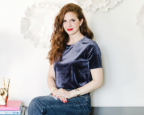
Erin Melkonian
Interiors Editor
Erin runs a collaborative design firm, EMID Design Group, specializing in healthcare, hospitality, and residential interior design, in Fresno, California. Seeing the world through an artistic lens has allowed Erin to experiment in a number of different styles. Everything she does with a space is deliberate. Every piece has a purpose and has been thought about, from color, to position, to scale in order to create the most unique and personal spaces for her clients.

